We worked with co-up in an ongoing basis. Therefore,lots of visual items including graphical and video, and lots of text contents were created and only some of them are presented in this portfolio.
Customer introduction
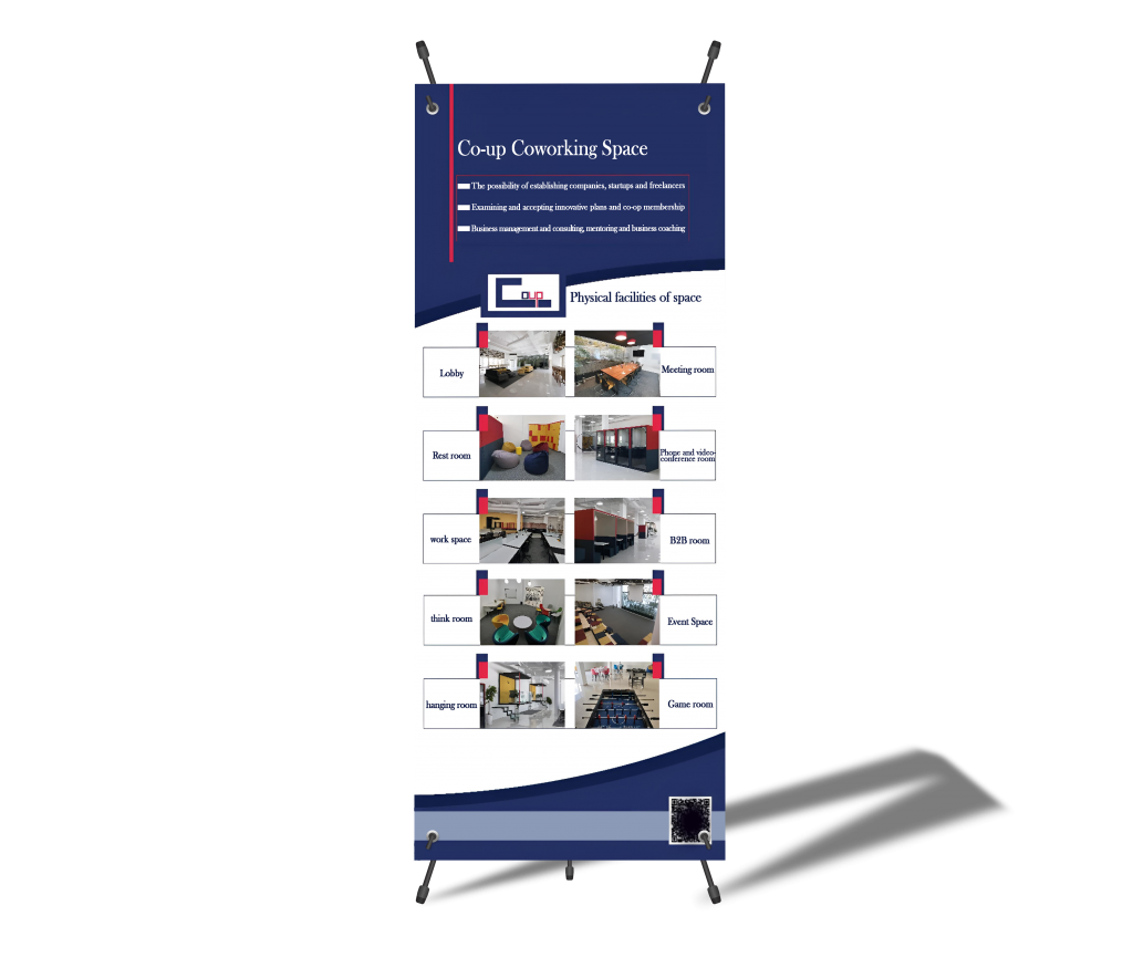
Co-up is a coworking space located in one of the technology parks. It aims to bring new startups together with large companies and work in the innovation and technology ecosystem. The audience includes is freelancers, entrepreneurs, and startup teams.
Custumer needs
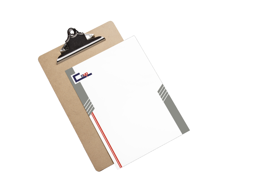
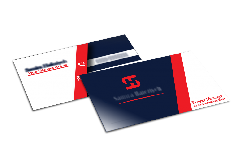
Co-up needed a visual identity that was in line with the interior design architecture and decoration of its physical space. The interior architecture of the coup is designed in a minimal style and uses dark red, yellow, red, white, and gray colors.
Process
In the meeting with the employer, we found out that:
Co-up audiences are innovative, creative, and entrepreneurial people. It was very important for the employer to have minimal and uniform designed items. They also wanted some of them have lots of images and shape connection. To prepare a color palette, we went to the colors that were used in the space and tried to choose the colors that show a more appropriate concept of the co-up using the psychology of colors. For the logo, the typography model was chosen to design a minimal and simple logo. Also, when designing other items, we tried to have simple designs that are uniform to satisfy the client.
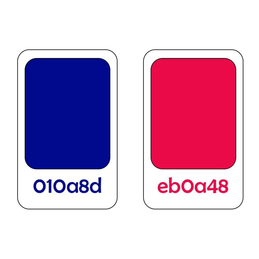
ColorPollet
Summer is a symbol of sincerity, creativity, trust,intelligence, independence,responsibility, honesty.
Red is the opposite and complements dark red, a symbol of motivation Composition:relaxation and excitement. complementing and expressing everything.
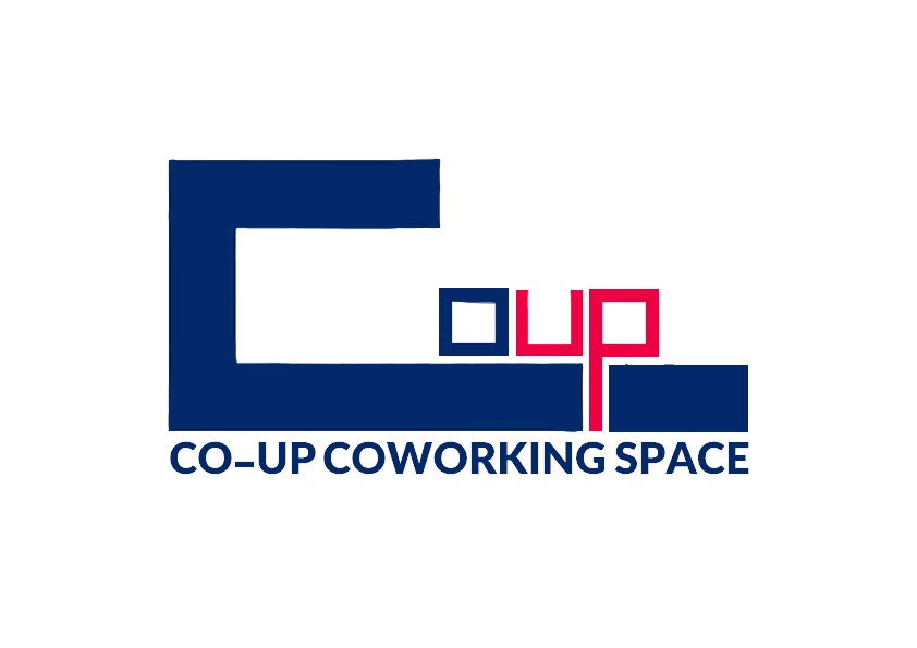
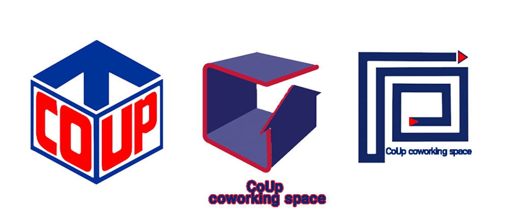
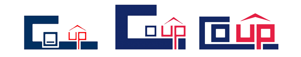
Logo
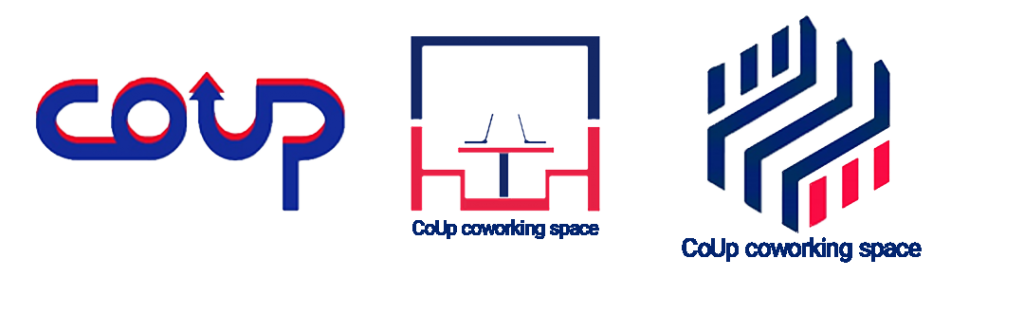
Many logos were designed for this project, but since being minimal and simple was very important for the employer, a simple typographic logo without elements was chosen as the final logo.