The customer needed a logo for an event supported by a Science and Technology park, where the audience and participants of the event were students and rofessors.
Customer introduction
.The client was a broker science and technology park that ordered a logo for one of their Startup events
Customer needs
The client needed a logo that was a combination of elements and typography. Another feature that was important for the employer was designing a logo in a minimalstyle.
Process
After meeting with the employer and identifying the audience, the initial sketches of the logo were drawn and then implemented in the .Illustrator software
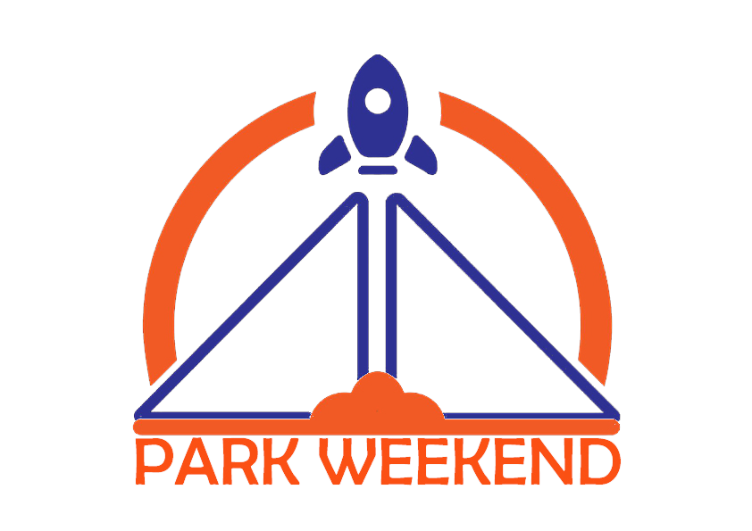
Result
K Data
Project Background
The employer of this project was a company that had created all its visual content and branding and was looking for a redesign of its company logo.
Customer introduction
The employer of this project is a company that operates in the field of data analysis. In terms of scale, it is considered in the category of medium companies.
Customer needs
.The client needed a logo that was visual and orange and gray must have been used in it to match theorganizational colors and the visual identity of their brand
Process
.After meeting with the employer and identifying the audience, the initial sketches of the logo were drawn and then implemented in the Illustrator software
Result
Start North
Project Background
The project is about visual identity of a company working in the field of investing on startups.
Customer introduction
Start north is a company trying to support start ups by investment specially in north America. This support is being carried out via a platform.
Customer needs
Start north required a logo as the most important part of their visual identity. Time was also one of the clients concerns.
Process
To start with, we presented the onboarding form including 20 clarifying questions. After recieving the answers, we started to analyze the form and we did a research about what seemed desirable for the client. Our design team cameup with lots of etudes and we analysed them regarding the onboarding form. Finally, 3 etudes were selected and sent to the client with their philosophy. The client chose one etude and our team worked on digitizing it with different colors and fonts. The client chose the one that met best with start North and it was finalized by our team and the files were deliverd.